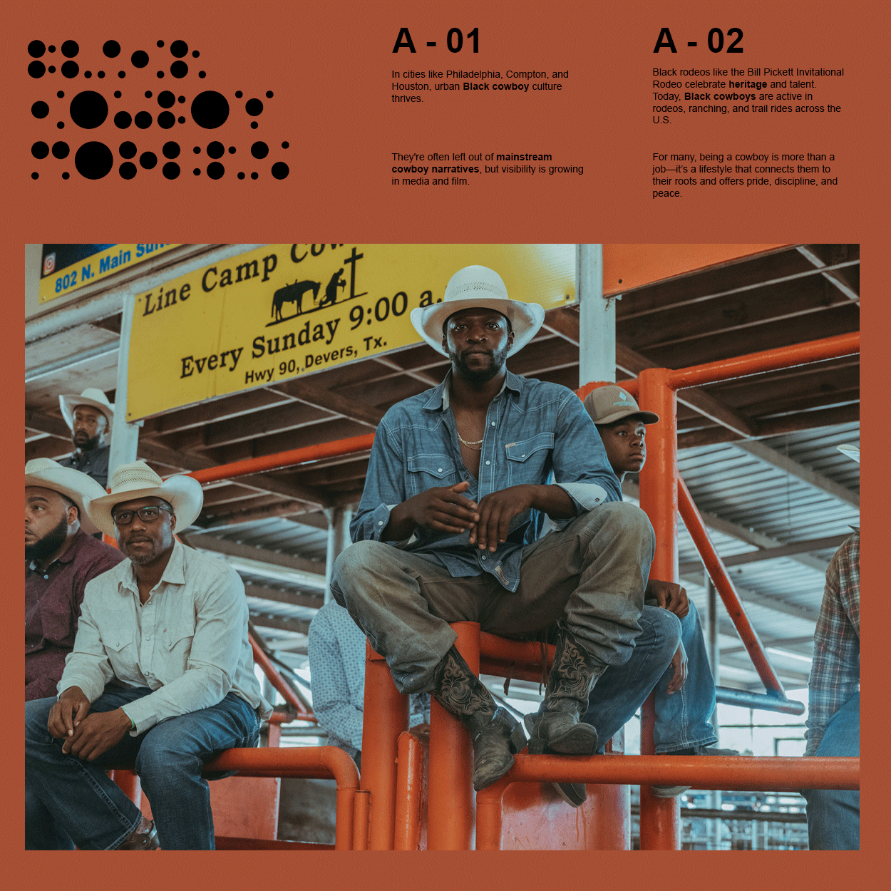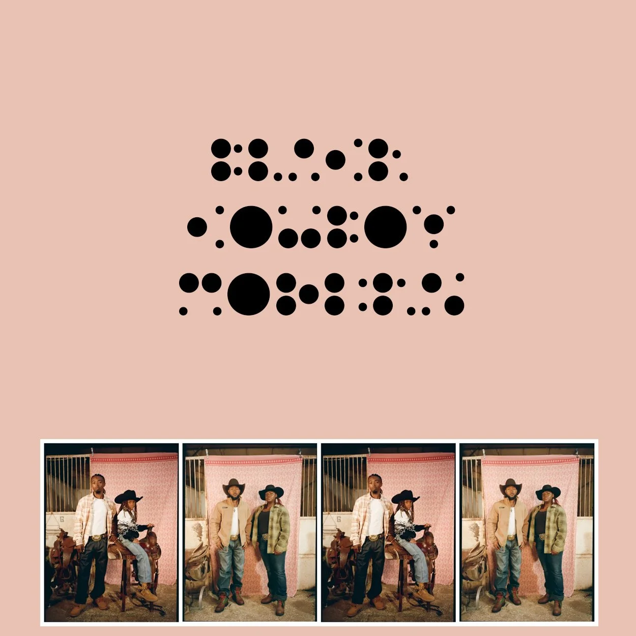
Five years ago, I began working on a font with a friend of mine and since then I have been consumed with it and integrating it into my personal design. We called it “Crescendrec”.
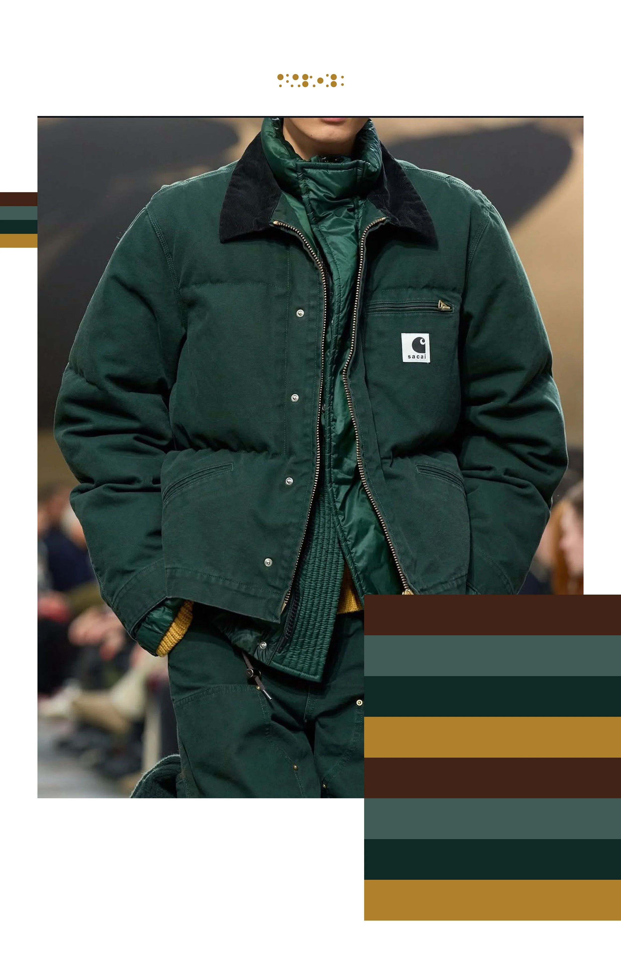
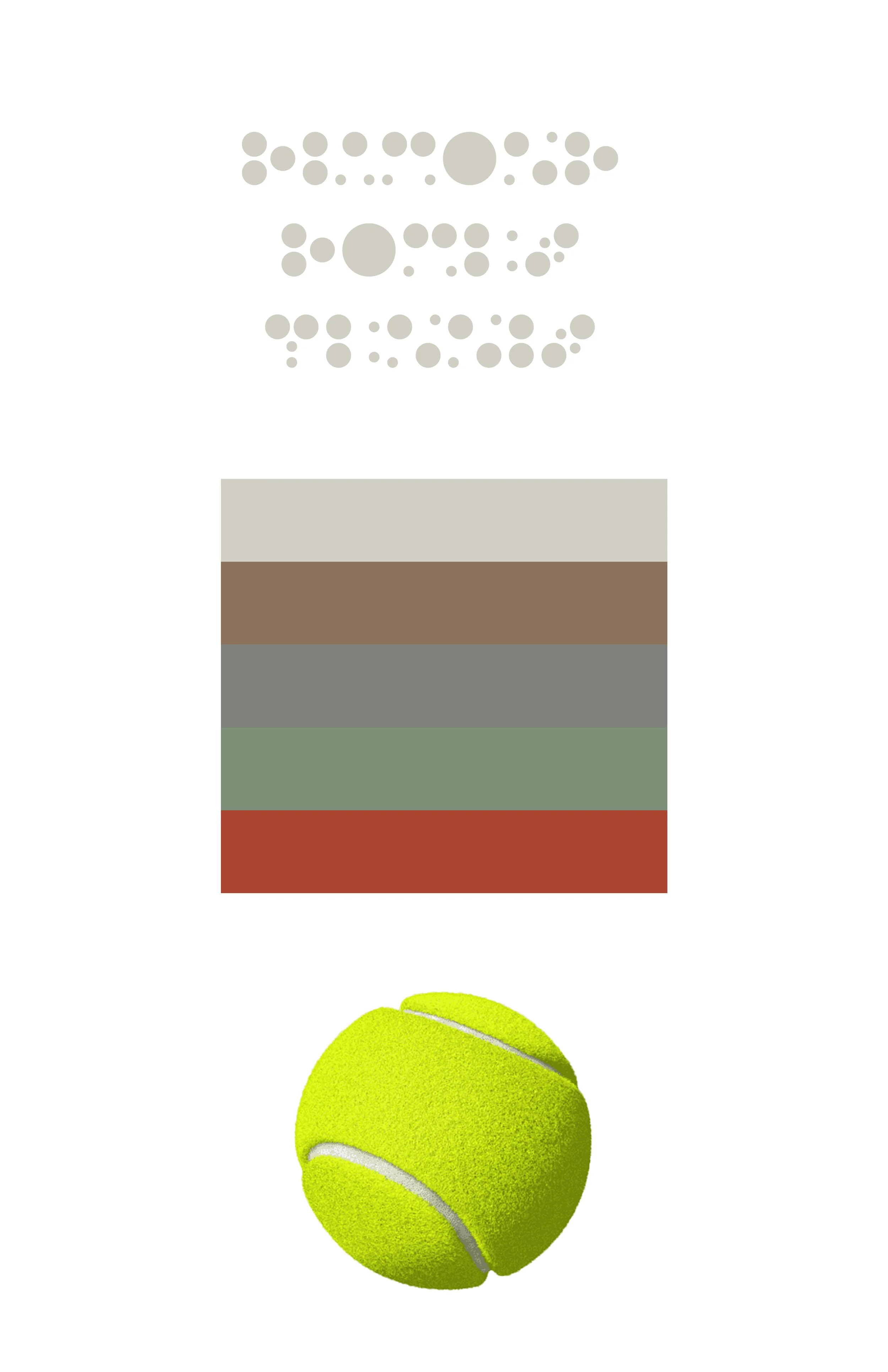
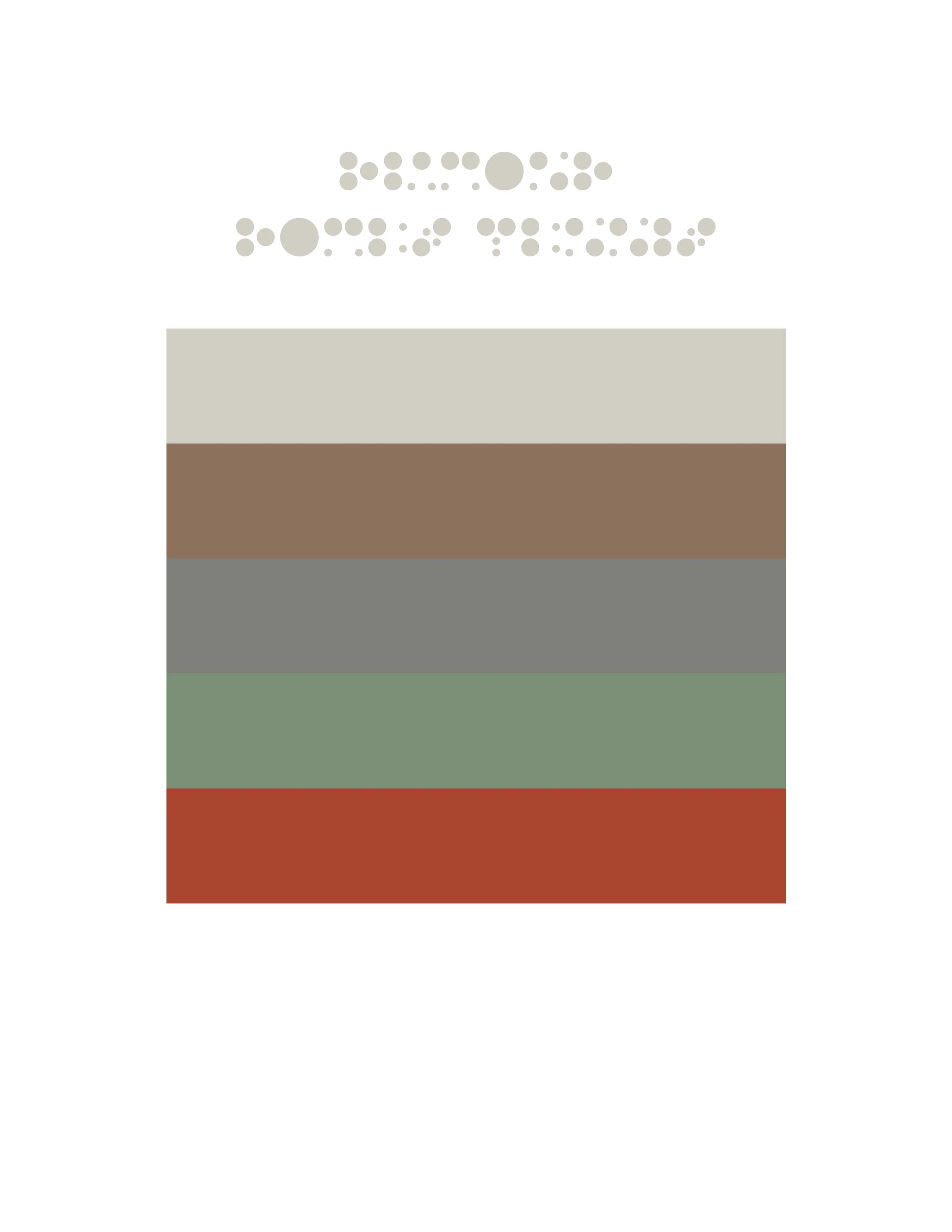
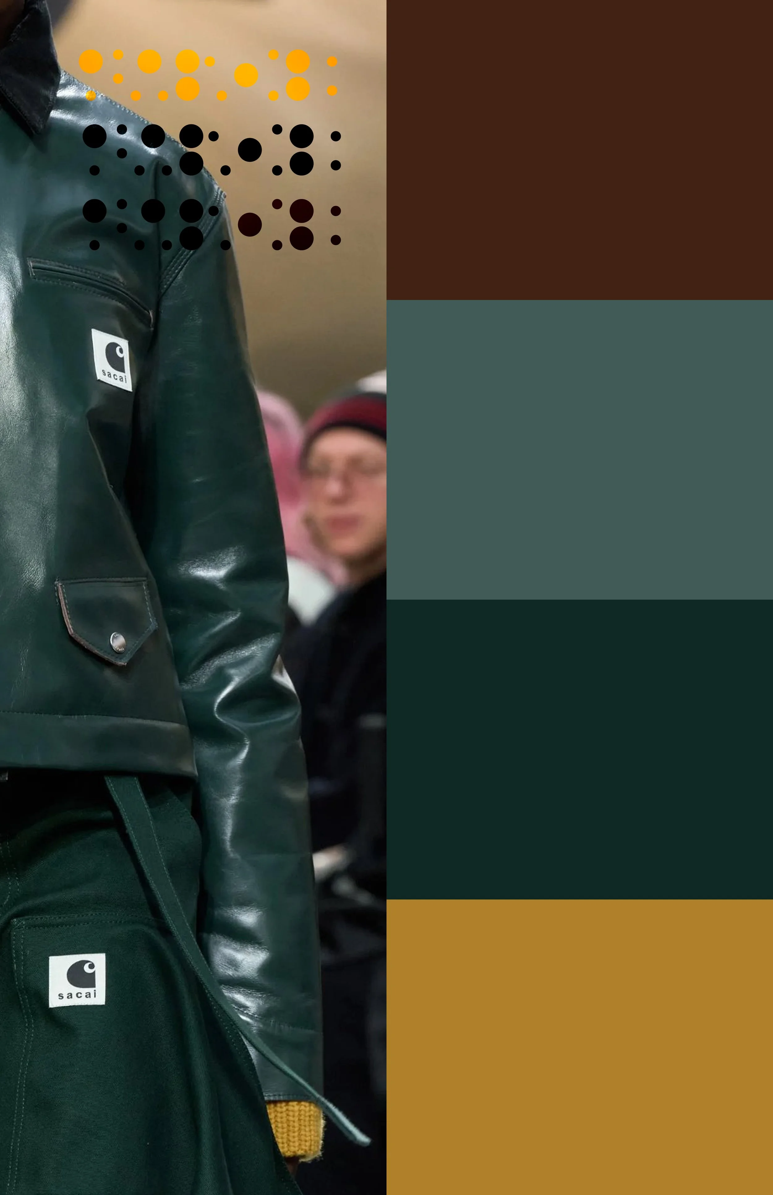
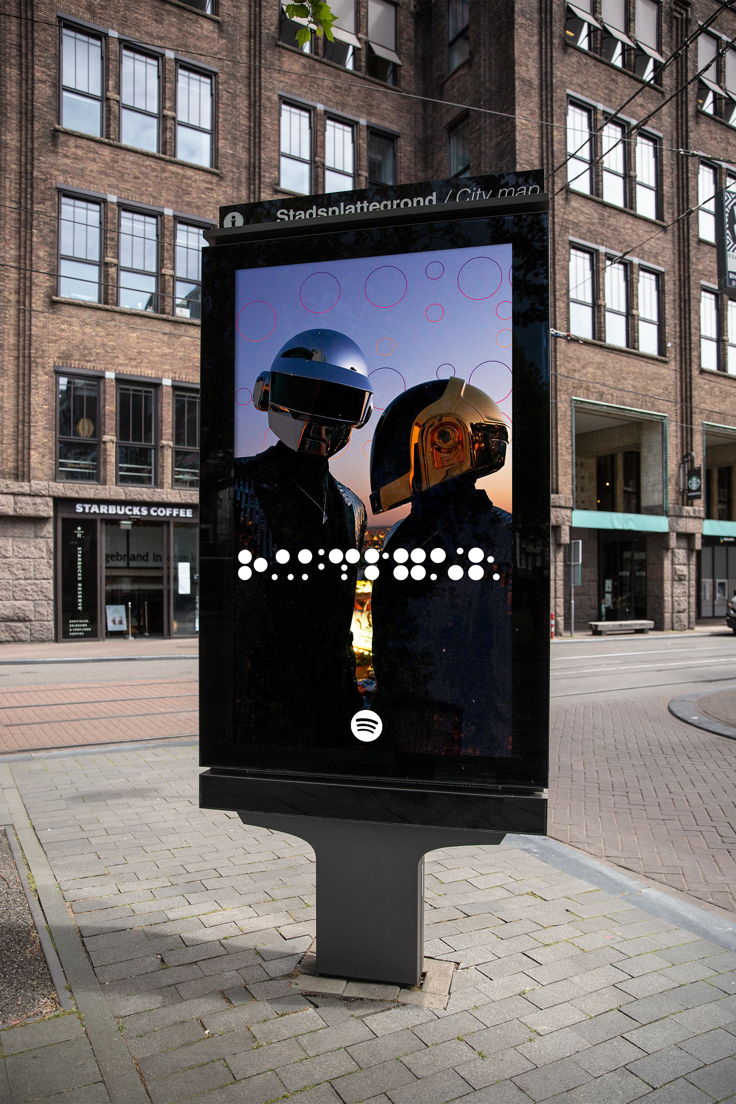
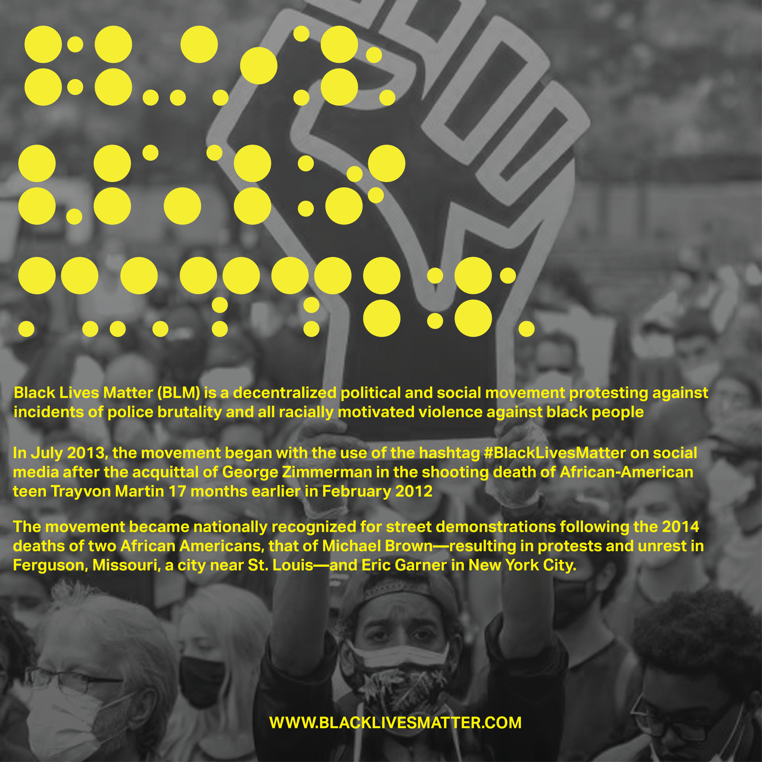
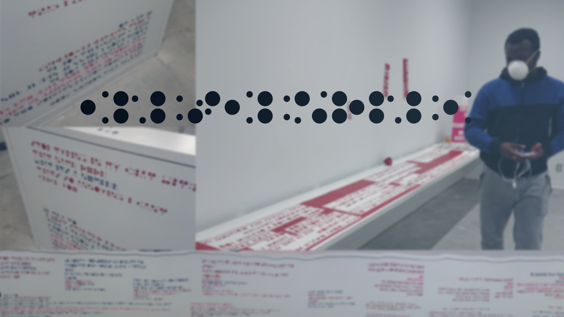
For a typography project themed 'Exotic,' I redefined the concept by finding the exotic in systematic minimalism and sci-fi precision rather than tropical imagery. Working in collaboration with German Eduardo, whose keen eye for detail and meticulous approach were essential to realizing the project's full potential, we created an abstract typeface using only four circles arranged on a square grid—with three available circle sizes, the requirement that all elements remain within the grid boundaries, and the rule that one circle must always anchor to either the center or corner of the grid. Letters like 'M' and 'W' became beautifully unrecognizable, which we embraced as essential to the exotic concept—after all, truly alien forms should feel unfamiliar and otherworldly. The resulting typeface, which we named Crescendrec, demands active engagement from viewers, who find themselves piecing together the circular elements to decode each letterform and working harder to identify complete sentences. What began as a collaborative school project has evolved into a fundamental part of my design practice—I now instinctively incorporate these geometric principles into poster designs, 3D work, and various other projects. The systematic approach and circular constraints have become part of my visual language, proving how a single experimental typeface can reshape an entire design philosophy.